Center for Antiracist Research:
Antiracist Society Website Map Redesign

Project Overview
Challenge
The antiracist society website is built for everyone interested in this topic and to see which organizations are working on antiracists in the United States. We already have the website, but now we are facing a challenge in that one of the organizations has too many virtual chapters throughout the states. This might cause the map on the website to be overwhelmed and all covered by one particular organization.
The goal
Created a new version of the map on the antiracist society website to make it more concise for audiences to read. In addition, to create a better experience for users to interact with the map.
Role
UX Designer, UX Researcher
Design toolkit
Figma
Project Duration
2 weeks
Design Process
1
User Research
User Interview
2
Analysis
User Persona
Pain Points
3
Design
Wireframing
Prototype
4
Testing
Usability Testing
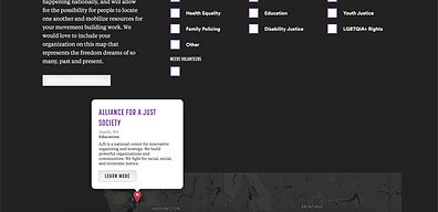
Original Design
Here's the map we are going to redesign


Desktop version

Mobile version

User Research and Analysis
Research plan
Conducted interviews with six potential users via Zoom video call. I aimed to discover their experiences and thoughts using the map on our Antiracist Society website. After the interviews, I summarized their pain points and user persona.
Interview question
Introduction
-
How old are you?
-
What’s your identified gender?
-
What is your occupation?
-
What do you study?
-
Where are you from?
-
What is your relationship with family and friends?
-
Who do you live with?
-
What is your long-term goal?
-
What do you think about antiracists?
-
Do you look at any websites which are relevant to antiracists?
If yes:
• How often do you engage with these sites?
• What is your goal when visiting these sites?
• What do you like about those websites? How about the thing you don’t like?
11. Do you consider yourself an antiracist or want to learn more about antiracists? If yes, do you consider to involve with any antiracist organization activity?
Asking participants to review and interact with the map on the Antiracist Society website.
-
What do you think about our map on the Antiracist Society website?
-
What about anything you think is lacking? What about anything you like?
-
What do you expect or want to see on the map?
Closing
-
Do you have any ideas or thoughts you think we might find valuable?
-
Do you have any questions for us?
User persona


Pain points
The map is less interactive.
Too many pins on the map. It was so hard to find what I want.
It was hard to use the map in the mobile version.
First version of the Prototype
After the user research and the discussion with the developer and project owner, we wanted to use color coding to identify different issue areas and chapters. Also, when users hover over the state, the color will change.


Testing
After the prototype, we asked 5 participants to do the testing for the website.
Parameters
-
Study type: Unmoderated usability study
-
Location: Remote
-
Participants: 5 participants
-
Length: 10 mins/participant
Findings
-
Feel the map is too basic.
-
Since the issues and chapters are too many, it was still hard to distinguish by color.
Final Prototype
What is changed?
-
Changed the map style from a basic map to a heat map (the color will be darker if the state has more organizations)
-
Created the new selection columns in pop-up cards instead of using color coding to distinguish issues and organizations. Users can choose organizations' chapters in the selection column to obtain more information about that chapter.


Final takeaways
The map is a tool for users to find useful information, and it's a vital element of the website. Creating an interactive map that works well on both desktop and mobile devices can be a complex task that requires careful consideration and planning, and it requires much time in research and testing. Discussion with the product owner and developer is also important because everyone has their concern and perspective about the project.